
Tax Plan Comparison
posted by Liberal Seagull at 11:05 AM
![]()
 Back in June, the Washington Post ran an interesting chart comparing the Obama and McCain tax proposals. It recently came to my attention when it was referenced in the Dr. Housing Bubble blog. First I'll give you the chart, then I'd like to talk a little bit about the misleading ways tax debates are often framed.
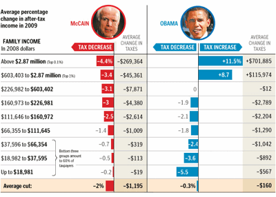
One of the biggest problems with tax debates is they're often framed only in terms of income tax. This is misleading for a couple of reasons:
First, families in the upper brackets often get much of their income from investments. Long-term capital gains aren't taxed as ordinary income — they're taxed at a flat 15% for the income levels we're talking about. This means wealthy taxpayers never really feel the full impact of tax rate changes.
Secondly, Social Security payroll taxes are only paid on income below $102,000. This means the tax system as a whole is considerably less progressive* than it first appears, since these taxes are paid at a flat 15.3%**.
Of course, the biggest caveat of all is that these plans would no doubt look very different by the time they got through Congress. Obama's proposal to raise the $102,000 cap on Social Security taxes would probably face a tough fight, for example.
* I use "progressive" here in the tax accounting sense — meaning a tax rate that increases with increasing income.
** This is a slight oversimplification. Self-employed persons pay 15.3%; everyone else pays half of that, with their employer paying the other half for them.


<< Home